
Et standard fixed layout med en bredde på 960px:
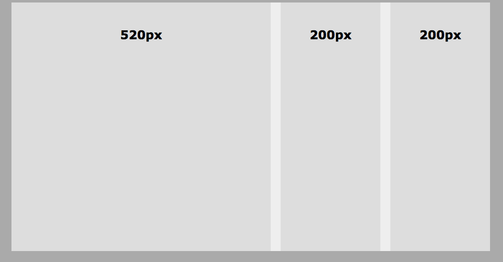
Css:
html {background-color: #aaa;} body { font-family: verdana; width:960px; margin: 10px auto; background-color: #eee; height: 500px; } section { float:left; width: 520px; background-color: #ddd; height:500px; } aside { float:left; width: 200px; background-color: #ddd; height:500px; margin-left: 20px; } aside.b {float:right; width: 200px; background-color: #ddd; height:500px; } |
Et fluid layout med 90% bredde:
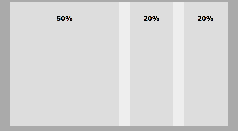
html {background-color: #aaa;} body { font-family: verdana; width:90%; margin: 10px auto; background-color: #eee; height: 500px; } section { float:left; width: 50%; background-color: #ddd; height:500px; } aside { float:left; width: 20%; background-color: #ddd; height:500px; margin-left: 5%; } aside.b {float:right; width: 20%; background-color: #ddd; height:500px; } |
Husk hvis du sætter en footer ind i overstående layout – skal du genopretter alm dokumentflow vha :
footer { clear:both; } |
Hvis ikke vil footeren lægge sig under headeren og forsvinde under de elementer som er floatet!